
Order A Professional Mobile-Friendly Website For Your Business
- Alina

- Jun 4, 2025
- 4 min read
Have you ever opened a website on your phone and had to pinch and zoom just to read it? That’s not the experience you want your customers to have.
These days, more than half of all web traffic comes from mobile devices. If your site doesn’t work on a phone, you’re losing visitors.
In this blog, I’ll walk you through why it’s essential to order a professional mobile-friendly website for your business, how it helps you grow, and what to expect from the process.
Key Takeaways
Mobile-friendly design improves user experience and builds trust.
More than half of users browse websites from their phones.
Google favors mobile-optimized sites in search rankings.
Fast, responsive design increases engagement and conversions.
Working with professionals ensures your site works on every device.
Why Mobile-Friendly Design Is Non-Negotiable
We live in a mobile-first world. People use their phones to shop, read reviews, book services, and learn about businesses. If your website doesn’t load correctly or is hard to use on a mobile screen, visitors will leave—and they might not come back.
When you order a professional mobile-friendly website for your business, you’re not just checking a box. You’re creating a better experience for your customers, making sure they can interact with your brand smoothly and confidently no matter where they are.
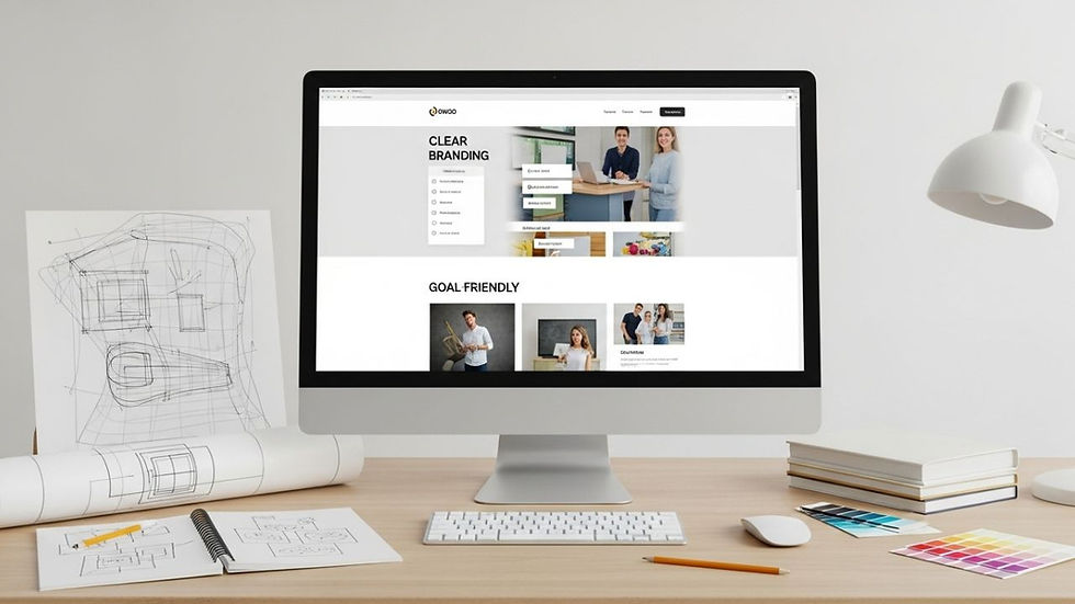
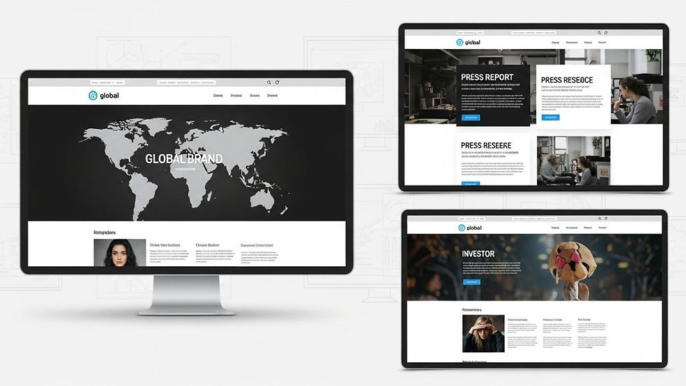
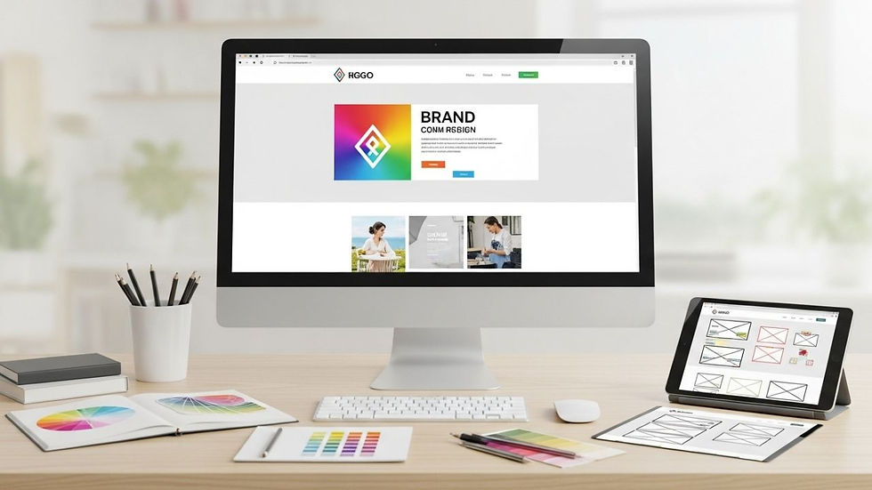
What Makes a Website Mobile-Friendly?
Responsive Layout
Responsive design means your site adjusts automatically to any screen size. Whether someone is browsing from a desktop, tablet, or smartphone, everything should resize and reposition without breaking.
Easy Navigation
On mobile, buttons should be large enough to tap easily. Menus should be simple and dropdowns should be smooth. A mobile-friendly site removes frustration.
Fast Load Times
Speed matters. Mobile users expect pages to load quickly. Delays can drive people away. That’s why mobile optimization includes image compression, clean code, and fast hosting.
Readable Content
Tiny text and crowded layouts are a mobile nightmare. A professional design uses proper font sizes, spacing, and layout to keep everything clear and easy to read.
How It Helps Your Business

Better User Experience
If people can use your site easily, they’re more likely to stay, browse, and take action. Whether they’re reading your story or clicking “Buy Now,” mobile design makes it seamless.
More Leads and Sales
Mobile-friendly design guides users toward your goals. It helps them fill out forms, make purchases, or call your office—all without frustration.
Higher Search Rankings
Google uses mobile-first indexing. This means it looks at your mobile site before your desktop version when deciding how to rank you. A poor mobile experience can hurt your visibility.
Stronger Brand Trust
A smooth mobile experience shows professionalism. It tells your audience that you care about quality—and about them.
Common Problems on Non-Mobile Sites
I’ve seen it too many times: sites that look great on a laptop but fall apart on a phone. Here are a few issues I often find:
Text that’s too small to read
Buttons that are too close together
Layouts that don’t fit the screen
Images that stretch or disappear
Pop-ups that won’t close
These problems don’t just annoy users—they damage your brand and cost you conversions.
What You Get When You Go Pro
When you order from a professional team, you get more than just a nice-looking homepage. You get a full package built to perform.
Custom Design
Your website should match your brand. That means colors, logos, layout, and messaging all align with who you are.
Fully Responsive Build
We make sure your site works on phones, tablets, and desktops—no matter the brand, size, or browser.
Optimized Speed and SEO
Fast load times, optimized code, and SEO-friendly structure give you a better shot at ranking on Google.
User Testing
Before launch, we test your site on multiple devices to catch any issues and make sure everything works perfectly.
Why Work with Experts
Designing a site that works on every device takes skill. It’s more than dragging and dropping elements on a screen. You need strategy, coding knowledge, and experience.
At www.officialwebsitedesigners.com, we help business owners order a professional mobile-friendly website for your business that’s not just responsive—but effective. We think about your goals, your audience, and your future growth.
We’ve built hundreds of sites that work great on mobile and drive real results. Whether you need a basic business site or a full online store, we’ve got your back.
When Should You Upgrade Your Site?
Your current site doesn’t look right on mobile
You’re losing traffic or sales from mobile users
Your bounce rate is high
You want to improve SEO rankings
You’re launching a new brand or product
How to Get Started
Step 1: Let’s Talk
We’ll have a quick conversation about what you need and what your goals are. No pressure—just clarity.
Step 2: Planning Your Site
We’ll map out pages, content, and features. Everything is built around your audience and goals.
Step 3: Design and Build
We create a layout, design the look and feel, and build your site with mobile-first principles.
Step 4: Launch and Support
After testing, we launch your site and provide support for updates, changes, and future needs.
My Opinion
A mobile-friendly site isn’t a bonus—it’s the baseline. Your customers expect it. Google expects it. And your business deserves it.
If your site doesn’t work on mobile, it’s time to upgrade. The good news is, you don’t have to figure it out alone.
When you’re ready to order a professional mobile-friendly website for your business, choose a team that understands how to make it work—for you and your customers.
Let’s build something that looks good, runs fast, and gets results—on every screen.
Comments